Power Apps provides a robust foundation for creating apps that can adapt to a variety of devices and screen sizes, so developers must understand how to use these modern features efficiently. By altering the modern screen design and implementing modern features such as badges, headers, and tab lists, developers may create galleries that are not only useful but also visually appealing.
Such modern galleries can considerably improve the user experience by displaying data in an organized, responsive, and visually appealing format. This tutorial is a great resource for anyone who wants to learn how to create responsive galleries with Power Apps.
Let’s get started!
Steps of Building a Responsive Modern Gallery in Power Apps
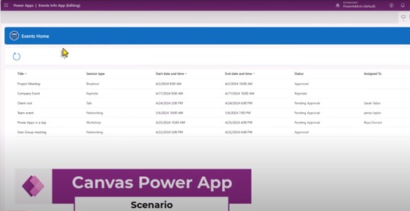
First of all, we have the following home screen experience without the implementation of a modern gallery. Here, you can see the event lists that are using SharePoint as the source of data platform.
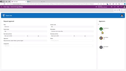
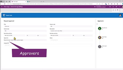
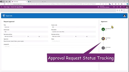
Now, if you click on the event, it will lead you to the form screen, which shows the details of an event. You can see the approval process here. On the right side, we have status tracking as well. One has already been approved, and the task has been assigned to another person. On this screen, users can also select the approvers.
Now, this is our scenario for creating a modern gallery through the Microsoft Power platform.
- Select the modern design
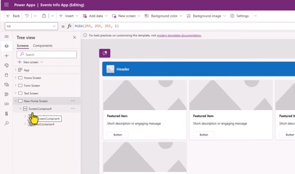
Step 1 is to navigate to the home screen experience to change it into a modern galley with modern controls.
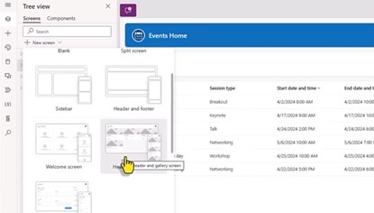
- Modern Screen using Template
Now, if you check these screens, you can see that the template is responsive, whether it is on the desktop screen, mobile screen, or any other device. As you click, the screen will adjust as per the screen.
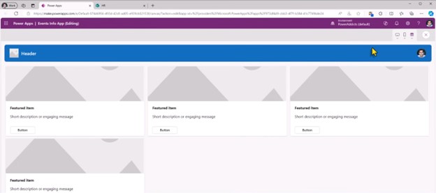
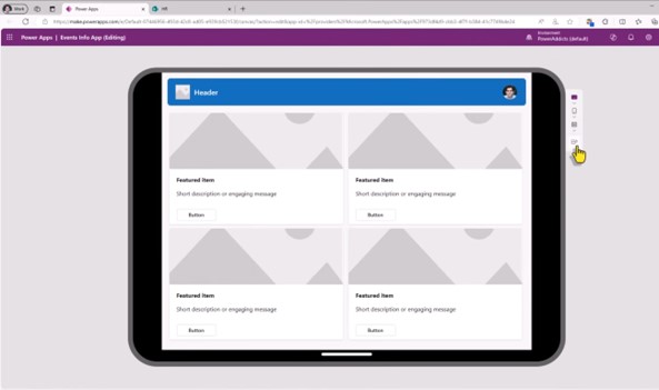
This further connects to the responsive container controls that the screen leverages to adjust for each screen.
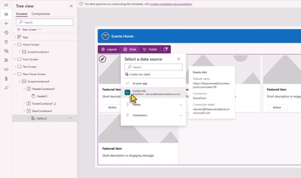
Let’s move to the gallery experience, here we will select the data sources. You can see the option of our scenario ‘event lists’ from SharePoint.
Now, once we have it applied, we can customize the gallery.
- Customize the gallery
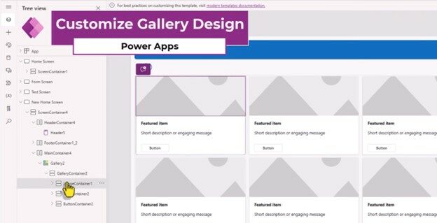
There, we can see the image containers, and we can both add and remove the containers as needed.
If we want to change the size of the container, we can simply use the template size bar above.
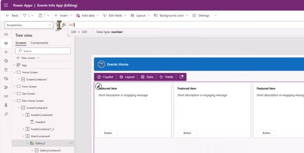
You can use the same bar to change the template padding and height. Then, you can click on the title container to make text changes.
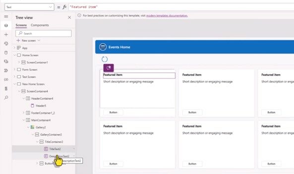
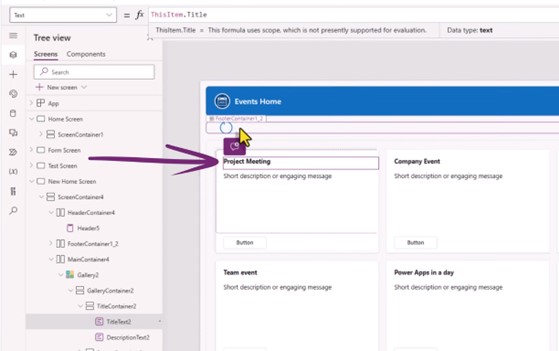
Here, you can change the item to any title you want to keep, just like we did in a project meeting. While setting the title, you can also change the description of the event using the description function.
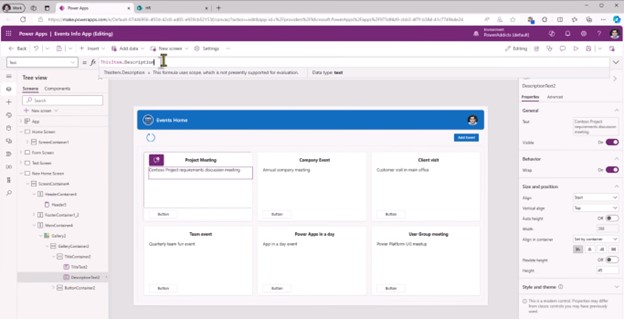
If you want to add additional information, such as a date and time, you will click on the text container and insert text.
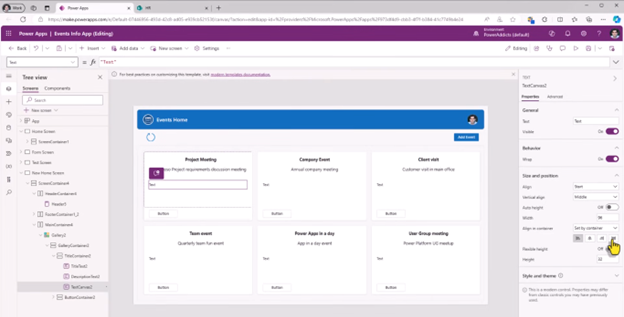
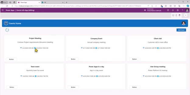
Now, in this text box, add the information of your choice. We added the start, end, and time of the meeting.
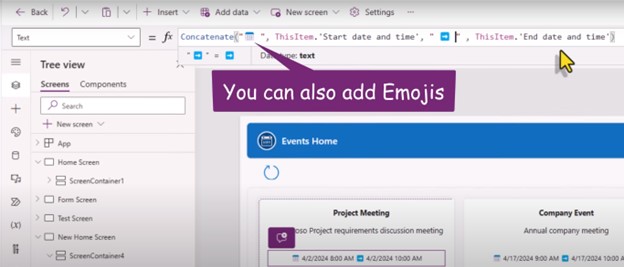
Next, we can view all the details on the container of our design, just like in the image below:
- Set the session type
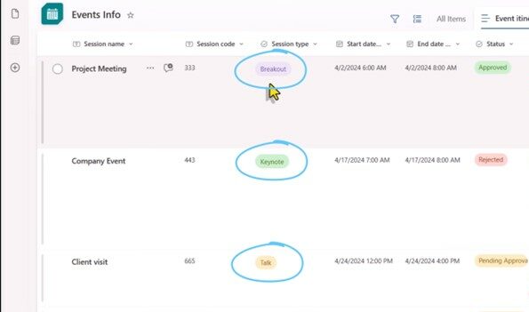
This is the step where we want to put the session type and session code inside the title container. Let us show you how to do it.
Select the title container and insert the horizontal container in it. We can select the height to adjust it in the container.
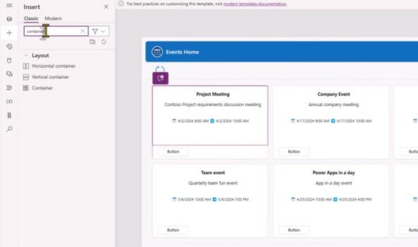
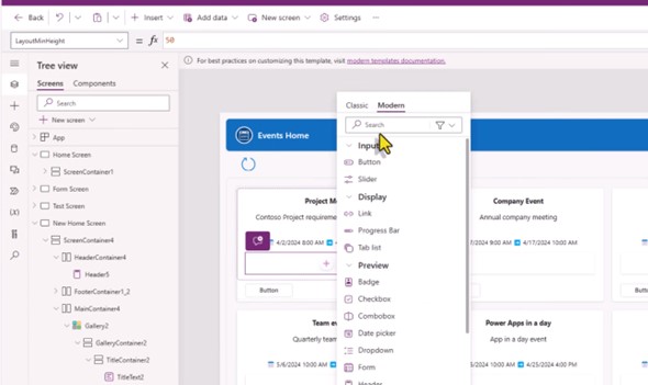
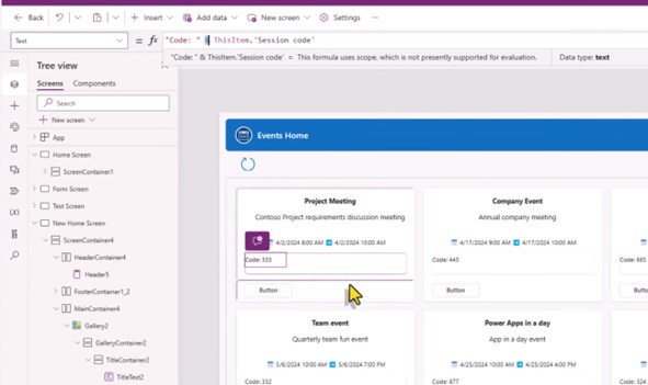
Furthermore, to add to the container, choose the text and add code using the code function.
Once the text is used for session code, you need a new container to add session types.
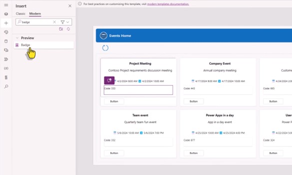
This is where we add the badge control to show the session type. We will give this container the height and width of our choice, and then, using the functions shown below, we can add the session type.
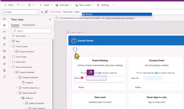
We can further adjust the containers from the tables in the right corner. Place them in the center or adjust any other properties according to your needs.
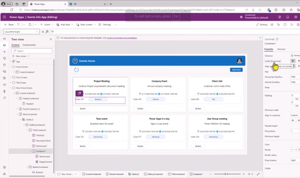
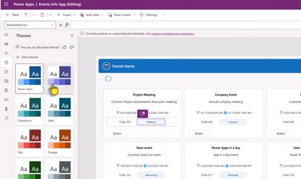
Even if you want to change the colour, it gives you a colour palette. If it is empty, it will pick the default colour of the power app.
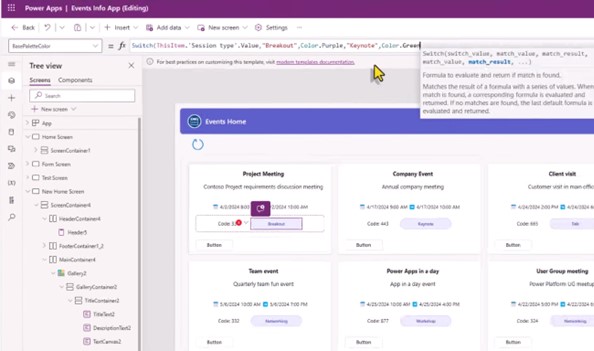
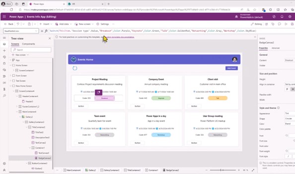
We can change it conditionally by using the functions just as we did in our scenario.
- Add modern header control
To do this, navigate to the bar on the left and insert the header control. Adjust the height to keep it in the title container. You can also control its properties from the right bar. Whether you want to show the logo or not is your choice; just turn on or off the toggle.
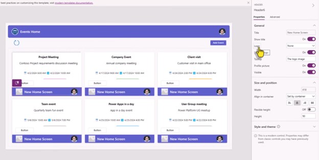
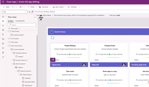
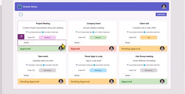
Further, you can change the property title while keeping the value of your choice. Change it to ‘thisitem.status.value’. The image below shows the approved, rejected, or pending approval on the header. Similarly, you can navigate through the other properties, such as userImage, with the conditions you want.
- Tab list control
Now, if we want to add the approvers on the container, we will change the button container from vertical to horizontal.
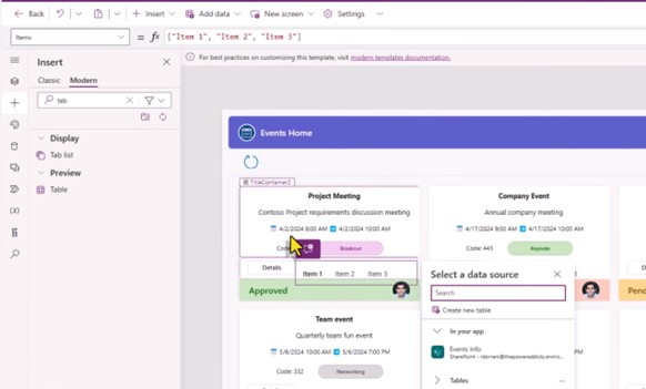
Further, we will add the tab list to show the approvers and the status alongside. We need to set the item property for it.
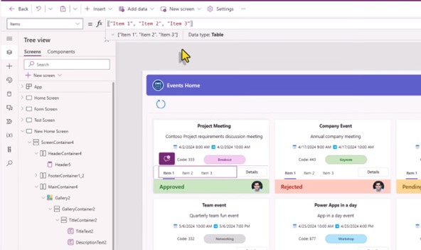
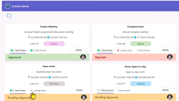
Now, we have approvers, status, and information about the decisions taken for the event.
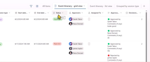
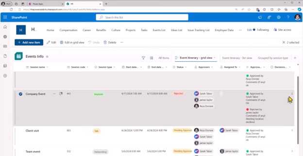
In our example, we select the company event, which has 3 approvers. The status is rejected, and 2 decisions are taken.
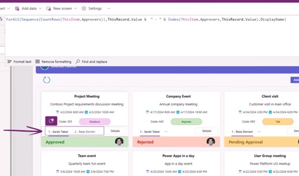
To show the information on the title and container, we will write a complete function that adds the items and values and displays names accordingly. You can use the functions you need. Change the code further to add more items to it such as status and other information.
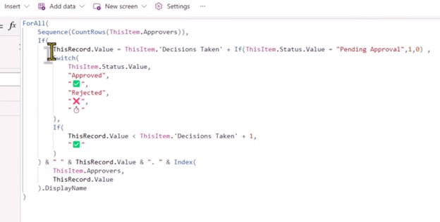
It also shows the emojis. So, for the final result, we can see the information about who approved or rejected it and whether the decision is pending.
Bottom line
Finally, you have more control and better visibility for your task management. If you are already using the Power Platform or Microsoft Power Apps, you are probably familiar with many functions and features. So, take control of your business data and make it easy to read for everyone looking for information at one glance.
If you need further assistance, DHRP experts have your back. Reach out for more.
All the screenshots in this blog are taken from this video. For video tutorials, please visit their channel.
